|
|
Post by Suzie on May 19, 2009 21:36:09 GMT -5
WELCOME TO HELLO Everyone!!!! Are you ready?  It's SHOW TIME!!! I have found another very interesting Font for you to use this week. I hope you enjoy finding various things to do with it. You can add them to a tag , animate them, make them sparkle, but try to have your finished results no bigger than 350 byes (for those on dial up). Beginners join in and try your hand with what you do know how to do, it isn't a contest but something to work the imagination and get the creative juices flowing and experiment with. Please remember your credits if you use an image in creating with the font. But most of all HAVE FUN!!! And Please show us your results here in this thread. The Font of the day is Called  And you can find it at this link. www.fonts101.com/xt_fontdetails_az_FID!14220~MoultiPass2~font.html |
|
|
|
Post by Deleted on May 20, 2009 0:56:59 GMT -5
 I know I know, its pretty lousy animating  |
|
|
|
Post by Huronna on May 20, 2009 1:46:49 GMT -5
It's necessary for me to MoultiPass2 on this one for a few days LOL
|
|
|
|
Post by sabban on May 20, 2009 8:23:49 GMT -5
|
|
|
|
Post by Betsy (RIP) on May 20, 2009 8:32:27 GMT -5
Neat font Suzie. I've added it to my list for stuff to play with today.
Love the Memorial day tag GB. Is that a Dover image? I don't see the credits.
That's cool Sue. Love the blings.
|
|
|
|
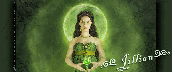
Post by Jillian on May 20, 2009 9:59:32 GMT -5
Yes GB's says Dover Image....but what the text says I have no idea? This font is not easy to read... Also Sue....look at your S in Sue and then the S in the example...Pass2...you appear to have used a different font...? Thought I should let you know...  |
|
|
|
Post by Suzie on May 20, 2009 10:15:41 GMT -5
Yayyyyyyyy GB. Ya did it...... But I do have to agree the words are hard to read. I am thinking the larger size you use the easier it would be to read. But I think it says Have A Safe Memorial Day.
Love the bling, err twirlie thingie, you used on yours.
NP Huronna. Would be hard to do this on an airplane lol.
Thanks so much for doing the challenge this morning ladies.
|
|
|
|
Post by Deleted on May 20, 2009 10:26:37 GMT -5
Hmm I agree about hard to read... I looked at Sue's S and the S on mine and they are the same... very interesting cuz I know I didn't change fonts whilst typing... I wonder if its the difference between upper case or lower case?  Ha! you have sharp eyes Jillian, cuz I never noticed the difference LOL... |
|
|
|
Post by Jillian on May 20, 2009 10:35:49 GMT -5
It's because that was my job......I was a Computer Typesetter Operator...I used to set
up the type for the jobs...maps, advertising, invitations etc.....so that's why I am interested
in the different (unusual) fonts...In your example GB...look not only at the top of the S but the bottom is a lot fatter....to me they appear to be different styles of font...
|
|
|
|
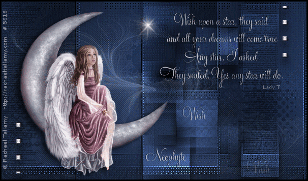
Post by neophyte on May 20, 2009 10:55:38 GMT -5
I had to go check and that's the difference....upper and lower case letters. |
|
|
|
Post by Betsy (RIP) on May 20, 2009 11:09:31 GMT -5
Great animation Neo.
|
|
|
|
Post by steve on May 20, 2009 14:21:24 GMT -5
|
|
|
|
Post by Suzie on May 20, 2009 14:29:31 GMT -5
Neo you are really flying high. Love the floaties in Remember.....
Steve you are definately a rocking dude here.
Thank you for doing the challenge and for the snags.
|
|
|
|
Post by joylinky on May 20, 2009 15:31:34 GMT -5
Made some tags with Jillians beautiful flower, It's a snag if anyone wants it. All fixed , Thanks , I fixed the others ones too, snag away!  |
|
|
|
Post by Suzie on May 20, 2009 15:45:55 GMT -5
Joy what a delightful tag and a real beauty.
I am going to have to ask you to do a repair job on your credits though. The flower was tubed by Jillian from a Picture that I believe Whispy donated and is now residing in our safe tubes. It would have to read AL2ST or AL2SafeTubes. So I will refrain from snagging until a you can repost with the correct credits, purdy please. I would hate for anyone to miss out on this snag. It is just tooooo pretty.
And Thank you so much for doing the challenge.
|
|
|
|
Post by Carol (RIP) on May 20, 2009 15:53:30 GMT -5
Great work everyone! That is a hard font to read though! I'll have to think of something....
|
|
|
|
Post by Carol (RIP) on May 20, 2009 16:16:17 GMT -5
 snaggable |
|
|
|
Post by Suzie on May 20, 2009 16:23:10 GMT -5
Just what I need to cool me off for the last couple of days Carol. Our temp yesterday was 106. Luckily it is only in the 90s today. Another cute one too. Thank you for doing the challenge.
|
|
|
|
Post by omieka on May 20, 2009 16:37:25 GMT -5
 I know it is really too blue but I like blue. I made another one too and this one is not blue.  Thank you for all the snags. |
|
|
|
Post by omieka on May 20, 2009 16:41:21 GMT -5
Well okay-- it is a little bit blue.
|
|
|
|
Post by Suzie on May 20, 2009 17:33:42 GMT -5
lol Diane. How about a whole bunch BLUE!!! But blue being one of my favs I think it is neat.......Both of them as a matter of fact.
Thank you for the snaggies and for doing the challenge.
Joy Thank you so much for reposting yours. Now I have picked it up and Thank you so much for the snag and the tag.
|
|
|
|
Post by Betsy (RIP) on May 20, 2009 18:14:03 GMT -5
More great tags. Thanks for the snaggables.
I'm still thinking on this one.
|
|
|
|
Post by energie on May 20, 2009 18:53:08 GMT -5
|
|
|
|
Post by Suzie on May 20, 2009 20:55:49 GMT -5
Oh Yea! There is another rockin dude by Energie. Way to go girl!!!
Thanks for doing the challenge.
|
|
|
|
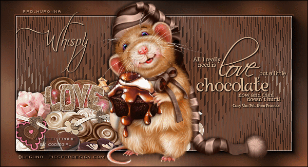
Post by whispy on May 21, 2009 10:12:28 GMT -5
I am sorry, the font is so hard to read I am having a time even reading the tags you all made. That is one reason I do not do most of the font challenges. I like fonts that are easier to read and lately they have been difficult. Can we have some easier on the eyes fonts please?
|
|